Deliverable
market research
user experience design
web development
usability testing
My Role
product manager
ux designer
Timeline
11 weeks
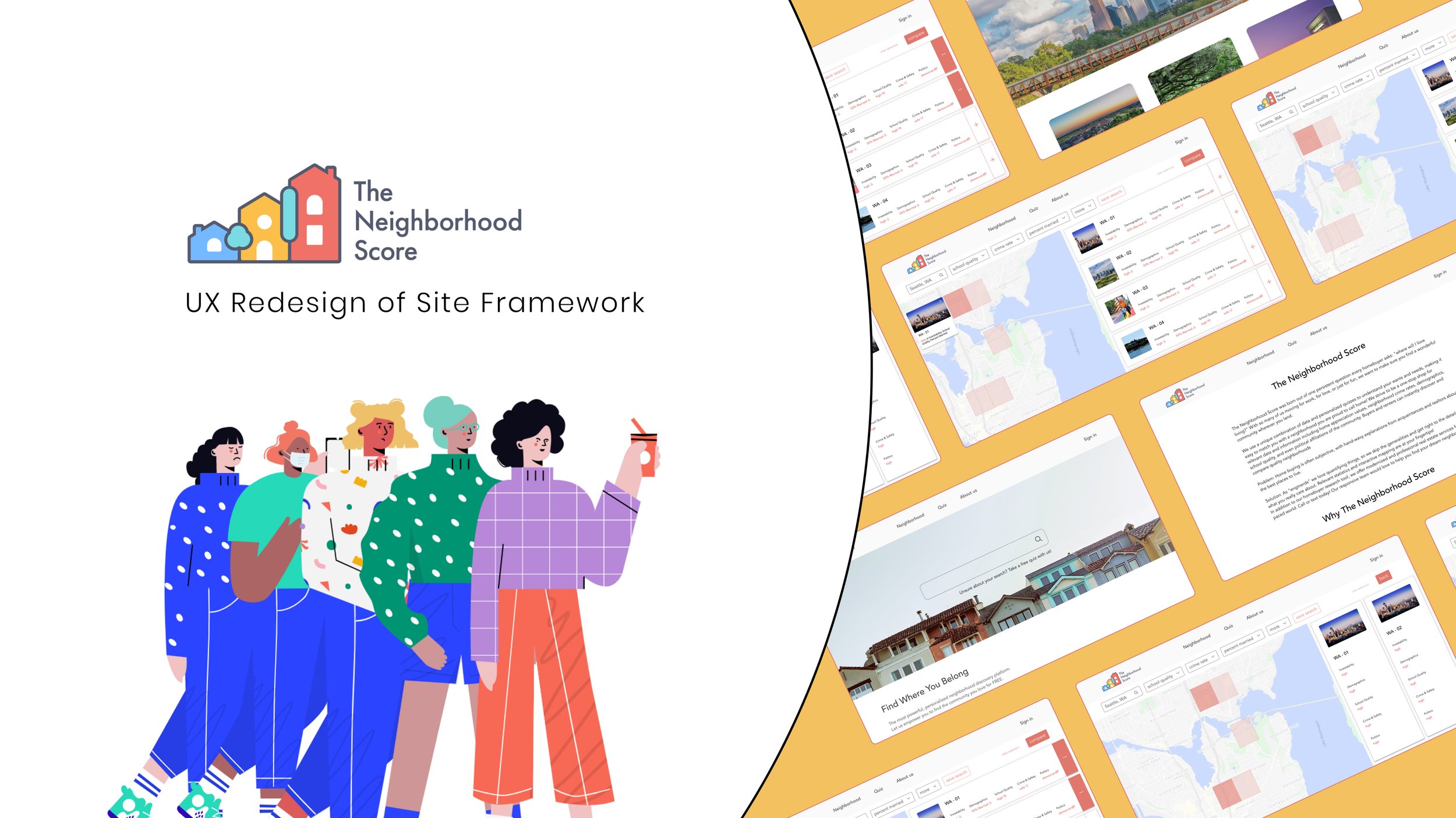
Project Summary
The Neighborhood Score is a Texas-based real estate startup. Instead of finding a specific house on Zillow, it enables its customers to learn more about the neighborhoods in the area before they make up their mind on purchasing a property.
The mission of this project is to redesign the current user experience for The Neighborhood Score (TNS). Specifically, the new design features important information on the map, such as crime rate and education quality, of specific neighborhoods to better facilitate our target audience, the millennials, in their home search.
The team consists of 3 designers (including myself), and 3 developers from Cornell graduate program. I managed our team’s communication with our client through weekly meetings and updates.
Timeline

Gantt Chart
I created the Gantt chart on the left to breakdown the workload among the designers and developers on this project. As the designers started to build wireframe and lo-fi prototype, the developers also began to develop basic web framework. Individual designers and developers were designated to different tasks each week and were asked to report their progress in the following week. According to different completion rate and client feedback, the timeline were adjusted to best reflect the expected progress.
Original Website
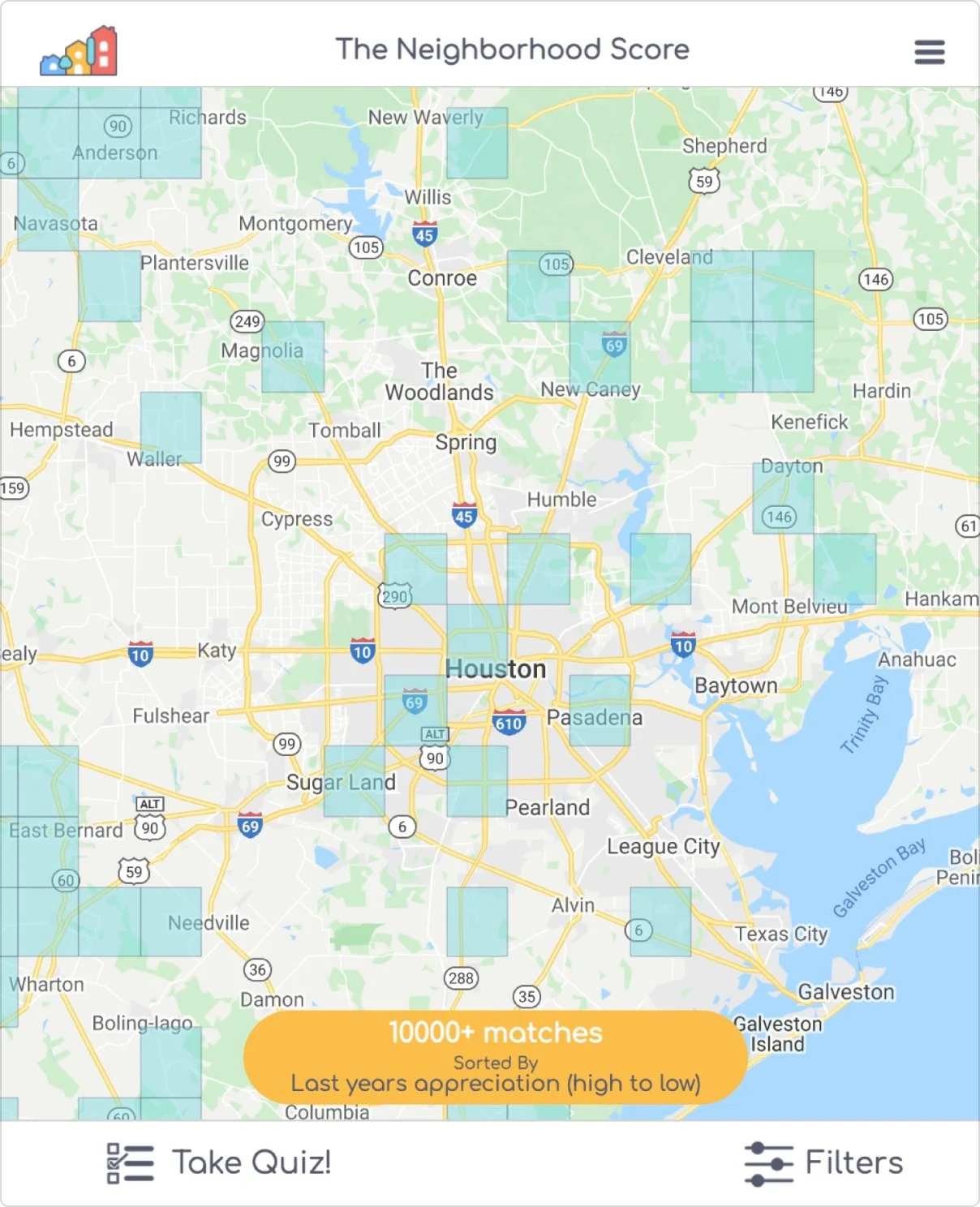

The original website from TNS is only designed in mobile view, where it presents a map to the user on the first screen. The neighborhood areas on the screens are presented in the square shape due to data limitation. With the amount of information on the first page, it can be overwhelming for users to navigate.
As I communicated with our client, they identify the current quiz function as one of the most important ways for them to connect with more potential buyers, since it can help them collect contacts.
Identify Features for MVP

After reviewing the website with the clients, I came up with the flow diagram to better help my team and our client to identify the must have features in our MVP for the 11 weeks duration. It includes search function, map filtering function and neighborhood compare function.
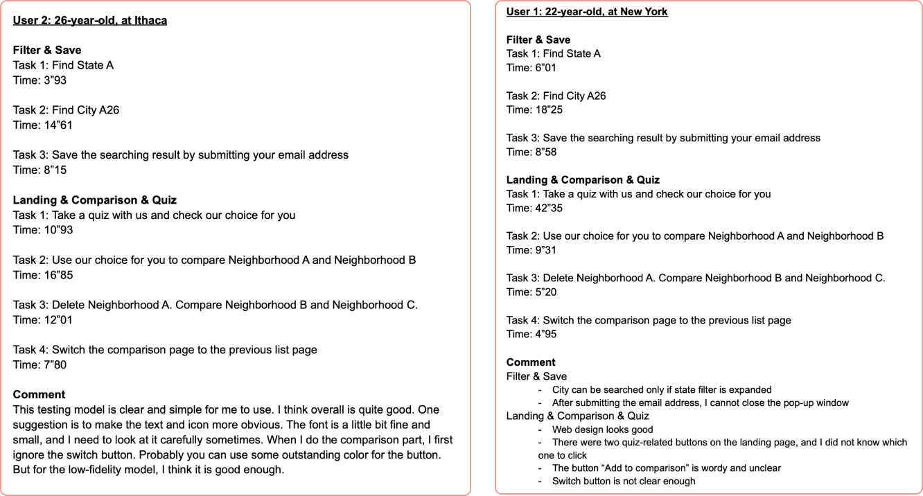
Interactive Lo-fi & User testing
As we designed the lo-fi prototype, I decided that it was necessary to make it interactive and perform an usability test on it. It was important for me as a designer to make sure that the flow of the product make sense to everyone before having the developers build out the entire website without proving the concept. Rather than having users disliking the final product, it is better to fail early because we can always make adjustment to the design according to the test result.


By running a usability test on usertesting.com with our lo-fi prototype, it forces the testers to focus more on the user experience and UX patterns on the website than the details of UI designs. As the testers were completing the tasks we assigned to them, we were able to get valuable feedbacks on our design decisions.

Design
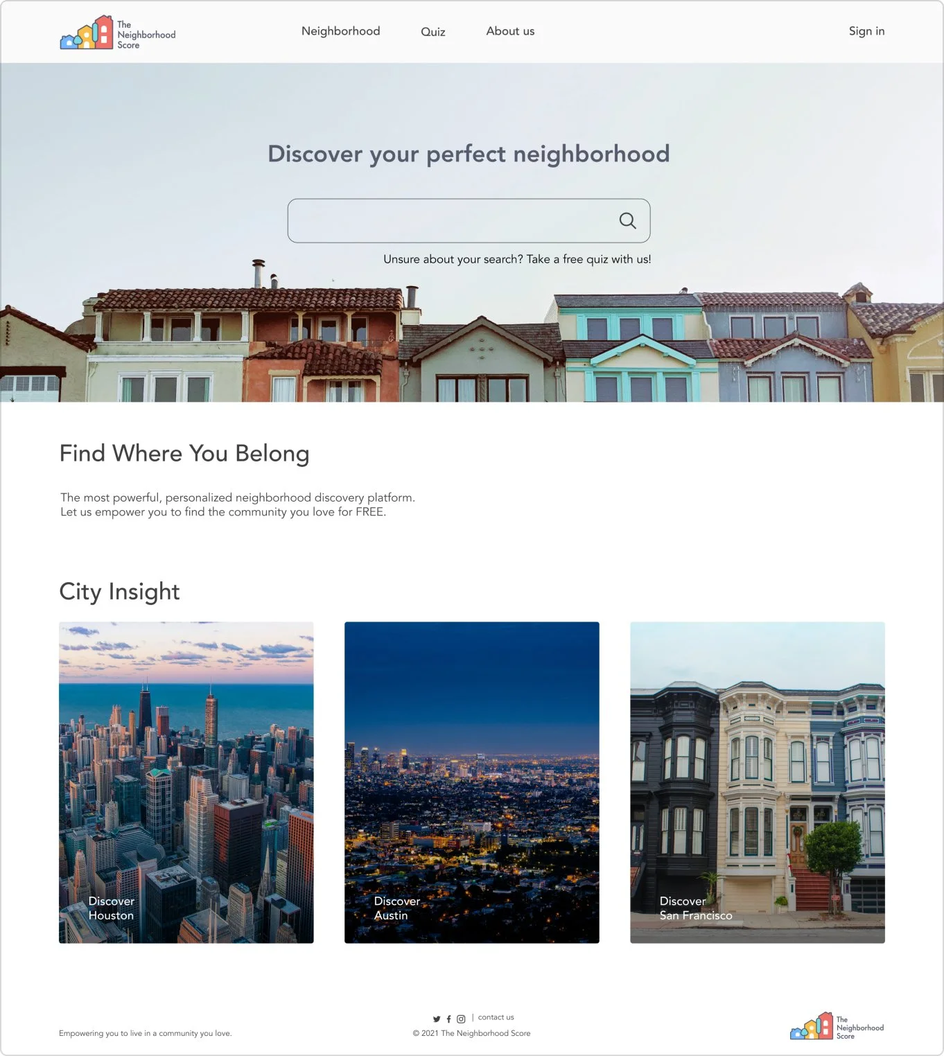
Landing Page
I designed the landing page for user to better navigate through different pages and functionalities on the website. By having the search function on the landing page, it declutter the amount of information that is shown on the map. Users can navigate through the map faster and find their desired neighborhood more accurately.
Map

original map

original filter
(took up whole screen)

redesign
In the new design, I proposed the idea of using split screens to present the map and neighborhood information on the same screen to the client. By using an interactive split screen design incorporated with a list view of cards, it provides the users a more engaging experience with the content on the page. The filters are now fix on top of the map for easy access. Comparing to the original design, the new design provides users with more interactive experience with the filter and more freedom in their search.
Compare Function

We introduced the new function, compare to the existing website. It allows the users to select 2 different areas from the list to compare the stats of each areas in a vertical view.
Mobile Design


In the mobile design, I adjusted the layout of the map page to better fit the mobile view. While the UX patterns and component stay the same, in consideration of mobile runtime and responsiveness, we took out some features and content on the mobile design.
Customer Acquisition Funnel

When it comes to communicating with the client as a UX designer, I found it effective to put my ideas and designs into their perspective of thinking.
At the time of our project, we identify customer acquisition rate as one of the most important indicators to pursue. Thus, we focused on the bottom of the funnel and tailored specific user tasks that can help our client to potentially acquire more customers through their online experience.
We designed these user tasks to retain the user growth and increase the possibility of customers entering the next level of our funnel.

Development
The developers on the team were able to build the entire website from scratch mostly with react. Within the time constraint, they were able to connect the front end with the existing client typeform and database to achieve the basic functionalities of the MVP.

Usability Testing
We recruited 10 participants in total. 5 of them were asked to complete a usability testing task for the original website, while the other 5 participants were completing the same task for our redesigned website.
The usability score of our redesigned website, calculated with Likert scale, improved 20% from the original website.

Throughout this project, I tried to have as much opportunity as possible for our team to receive real time, rapid feedback from both the client and users who participated in our usability test. It was beneficial to us because we can constantly make small changes to perfect our product along the way.
Takeaway
Asking When, rather than Should: We identified many actionable steps in the UX flow of the product. Almost all of these functions and features are valuable to the product. Team will debate “should”(we do it) when the question really is “when”. - Are they good to implement these features right now?
Realistic expectation: As the product manager and UX designer on the team, I realize the importance of setting realistic expectation not only among the team members but also with client.
Pivot as needed: Either due to technical challenges or the limited resources provided by clients, it is of vital importance for me, as the product manager, to pivot the direction of the product as needed in order to come up with the MVP.
Next Step
As we handed off the project to the client, The Neighborhood Score, we listed out many actionable steps. For instance, from a usability point of view, it is unintuitive for maps to use squares to present the shape of any neighborhood. Thus, we came up with a more detailed design to inform our client about the potential change that could be made to their product.

It is also imperative for a start-up company like The Neighborhood Score to consider the trend in the real estate market since the buyers are slowly shifting from the millennials to generation Z. The language of the product should change accordingly to the new market research.